The best finish for Toronto’s old walls isn’t about just hiding flaws; it’s about strategically choosing a material that respects the wall’s history and withstands city life.
- High-quality wallpaper offers superior flaw coverage and long-term durability, especially for high-traffic areas and problematic historic plaster.
- Proper surface preparation, particularly skim coating on old plaster, is non-negotiable and represents the majority of the work and cost for a lasting finish.
Recommendation: For historic Toronto homes with significant plaster issues, a textured or high-quality patterned wallpaper is the smarter long-term investment. For minor drywall flaws in a modern condo, a high-build paint in a satin finish offers the best balance of aesthetics and practicality.
For any renovator staring at the cracked, uneven plaster of a Cabbagetown Victorian or the builder-grade texture of a Liberty Village condo, the question is always the same: paint or wallpaper? The common advice is a simple trade-off. Paint is cheap and easy; wallpaper is expensive and better at hiding things. This is the surface-level conversation, the kind that ignores the unique character and challenges of Toronto’s diverse housing stock.
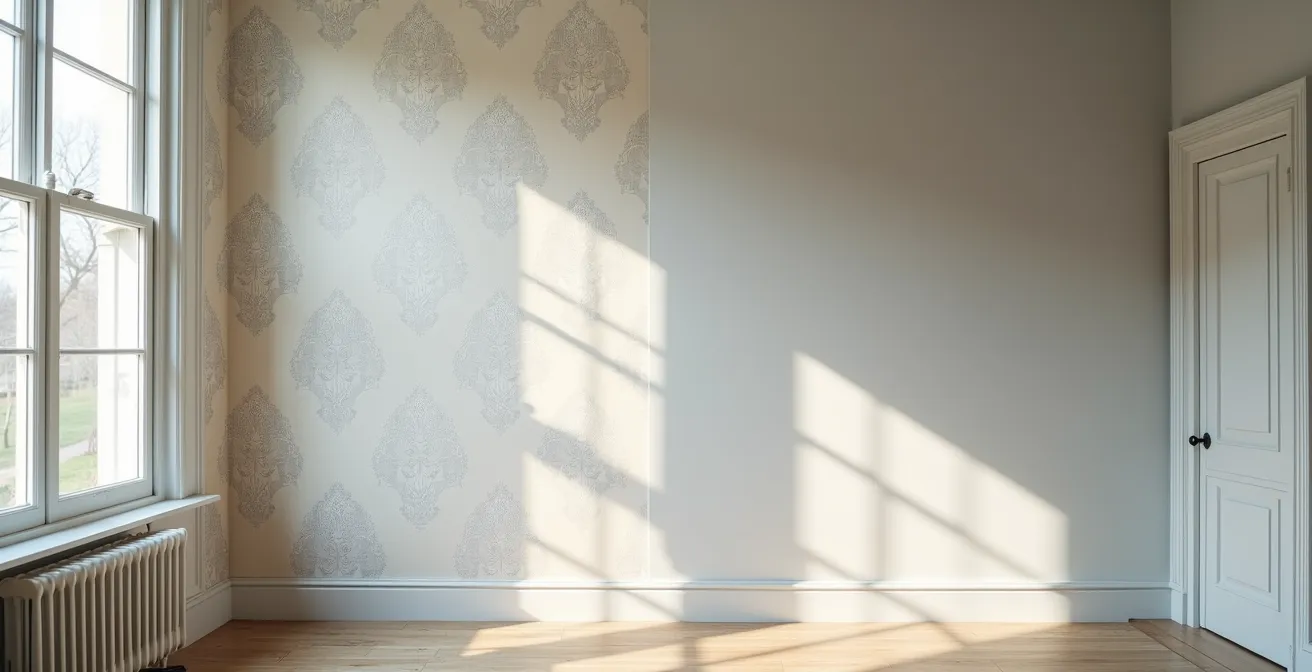
The reality is that treating an old wall is less about decoration and more about material science. The true challenge isn’t just covering a flaw, but choosing a surface that works with the substrate beneath it. It’s about understanding how the intense, low-angle winter sun reflects off a wall versus the hazy, humid light of a Toronto summer. It means considering if a finish needs to breathe to manage moisture from old brick or if it needs the sheer durability to withstand a family’s daily life in a narrow hallway.
But what if the key wasn’t simply choosing between two products, but understanding the wall itself as a system? This guide moves beyond the generic pros and cons. We will analyze the decision through the lens of a professional surface decorator in Toronto. We’ll explore why preparation is the real work, how Toronto’s specific light dictates colour, and which materials offer the best return on investment for the city’s most common wall types.
This article provides a structured approach to making the right choice for your specific project. By examining the crucial factors from ecological impact to practical application, you’ll gain the strategic insight needed to transform an imperfect wall into a feature of lasting value and beauty. The following sections will guide you through each consideration.
Summary: Wallpaper or Paint: Which Coating Should You Choose for Flawed Old Walls?
- Eco-Friendly Paint: Why Is It Crucial for a Child’s Room?
- Sanding and Priming: Why Is 80% of the Work Done Before Opening the Paint Can?
- The Sample vs. the Full Wall: Why Does Colour Change with Daylight?
- Matte, Satin, or Gloss: What Washability for a High-Traffic Hallway?
- Drop or Straight Match: How to Calculate the Number of Rolls Without Running Short?
- How to Use Colour Psychology to Enlarge a Dark Toronto Condo?
- How to Modernize a Victorian Home in Toronto Without Destroying Its Historic Soul?
- Spray Foam or Mineral Wool: Which Insulation for Old Brick Walls?
Eco-Friendly Paint: Why Is It Crucial for a Child’s Room?
When selecting a finish for a child’s room or nursery, aesthetics take a backseat to health and safety. The primary concern is the presence of Volatile Organic Compounds (VOCs), chemicals released into the air from paint as it dries. These compounds can contribute to indoor air pollution and have been linked to respiratory issues. For a space where a child spends a significant amount of time, minimizing exposure is not just a preference; it’s a critical health consideration. Fortunately, regulations and product innovations have made this much easier for Toronto renovators.
In Canada, paint formulations are governed by strict environmental laws. According to Canadian Environmental Protection Act regulations, the architectural coatings category has a maximum VOC limit of 150 grams per litre for most interior paints. However, leading manufacturers now offer “zero-VOC” options that go far beyond this standard. These paints contain minimal to no VOCs in the base paint, making them the default choice for sensitive environments. Brands like Benjamin Moore’s Eco Spec and Farrow & Ball’s natural paints are readily available at Toronto retailers and are specifically designed for this purpose.
It’s important to note that the “zero-VOC” label applies to the untinted base paint. Adding conventional colourants can reintroduce VOCs into the mixture. When having paint tinted, especially in darker, more saturated colours, always request VOC-free tinting. Furthermore, even with zero-VOC products, proper ventilation is key. Allowing the paint to cure for at least 48 hours before the room is occupied ensures that any residual compounds have fully dissipated, creating the safest possible environment for a child.
Sanding and Priming: Why Is 80% of the Work Done Before Opening the Paint Can?
Any seasoned renovator in Toronto knows that a perfect finish is not born from the final coat of paint or the last strip of wallpaper. It is built upon a flawless foundation. The expression that “80% of the work is in the prep” is not an exaggeration; it’s a fundamental truth, especially when dealing with the city’s diverse and often challenging wall surfaces. The time, effort, and cost of preparation vary dramatically depending on the age and construction of the home, a critical factor in any project budget.
For a cosmetic renovator, understanding the substrate is paramount. The cracked and crumbling plaster of a pre-1920s Victorian home in The Annex presents a completely different challenge than the nail pops and visible tape seams of a 1990s suburban house in Scarborough. Historic plaster is often brittle and uneven, requiring meticulous patching and, in many cases, a full skim coat—the process of applying a thin layer of joint compound over the entire surface to create a new, perfectly smooth canvas. This is a highly skilled, labour-intensive job that is the true secret to making old walls look new.

As the image above demonstrates, skim coating is a transformative process. It physically bridges the gap between a damaged, uneven past and a smooth, ready-for-finish future. This meticulous work is what allows either paint or wallpaper to adhere properly and look professionally finished. Ignoring this step is the most common cause of failure, leading to peeling paint, visible imperfections, and wallpaper seams that lift over time. The table below outlines the distinct preparation needs and associated costs for common Toronto wall types.
| Surface Type | Common Issues | Preparation Required | Toronto Cost Range |
|---|---|---|---|
| Victorian Plaster (Pre-1920) | Crumbling, cracks, uneven surfaces | Skim coating, specialized primers, extensive patching | $4-8 per sq ft |
| 1990s Drywall | Nail pops, tape seams, minor imperfections | Sanding, standard primer, spot repairs | $2-4 per sq ft |
| Modern Condo Drywall | Builder-grade texture, semi-gloss finish | High-adhesion primer, light sanding | $1.50-3 per sq ft |
The Sample vs. the Full Wall: Why Does Colour Change with Daylight?
One of the most frustrating experiences for both renovators and clients is when a carefully chosen paint colour looks completely different once it’s on all four walls. That perfect greige from the tiny paint chip suddenly appears purple, or the subtle off-white looks stark and clinical. This phenomenon isn’t a trick of the eye; it’s a lesson in the physics of light, and nowhere is it more pronounced than in Toronto. The city’s unique lighting conditions can dramatically alter colour perception, making proper testing an non-negotiable step.
A colour is not an absolute; it is the reflection of light. The quality, angle, and temperature of that light determine what we see. As one local expert notes, Toronto’s environment creates a complex lighting challenge. In the words of a Toronto Interior Design Expert from an article in Design Principles for Urban Environments, one must decode the city’s unique light.
Decoding Toronto’s Unique Light: The city’s specific light conditions—from the intense, low-angle winter sun to the hazy, humid summer light and reflections from neighbouring glass towers—dramatically alter colour perception.
– Toronto Interior Design Expert, Design Principles for Urban Environments
A north-facing room in a Rosedale home will receive cool, indirect light all day, which will amplify blue and green undertones. A west-facing condo in CityPlace will be flooded with warm, golden light in the afternoon, making beiges look more yellow. The reflection from a neighbouring glass condo tower can cast an unexpected cool or warm hue onto an interior wall. This is why painting a small swatch directly on the wall is one of the biggest mistakes a renovator can make. The existing wall colour will influence the sample, and it’s impossible to move it around to see how it reacts to different light.
Your Action Plan: Auditing Paint Colours in Toronto’s Light
- Create large movable sample boards (minimum 2×2 feet) using primed foam core instead of painting directly on walls.
- Test colours at four key times: bright morning (8 am), high noon, late afternoon (4 pm), and in the evening with artificial lights on.
- Place samples on different walls, specifically comparing a north-facing wall (for cool light) and a west-facing wall (for warm sunset evaluation).
- Account for seasonal shifts; be aware that Toronto’s winter light is approximately 40% cooler in temperature than its humid summer light.
- Test textured wallpaper samples alongside paint to compare how their surfaces absorb or reflect light differently.
Matte, Satin, or Gloss: What Washability for a High-Traffic Hallway?
When choosing between paint and wallpaper, the debate often extends to finish and durability, especially in high-traffic zones like hallways, mudrooms, and kitchens. These areas are subject to scuffs from bags, fingerprints, and general wear and tear. The choice of finish is therefore a strategic balance between aesthetics and practicality. While paint offers a spectrum of sheens, modern wallpaper presents a surprisingly resilient alternative.
For paint, the rule is simple: the higher the gloss, the more durable and washable the finish. A matte or flat finish has a beautiful, velvety look that hides imperfections well but is notoriously difficult to clean. A high-gloss finish is tough as nails and easy to wipe down but highlights every single bump and flaw on the wall. For most high-traffic areas, a satin or eggshell finish offers the best compromise. It provides good scuff resistance and washability without the harsh glare of a semi-gloss or gloss paint.
However, this is where wallpaper can truly outperform paint. While traditional papers are delicate, modern innovations have created incredibly durable products. A prime example is vinyl-coated wallpaper. The following case study highlights its suitability for demanding environments.
Toronto Mudroom Durability Test
Vinyl-coated wallpaper is exceptionally versatile and ideal for rooms like kitchens, bathrooms, and mudrooms due to its high water resistance. The manufacturing process involves coating a printed paper base with acrylic vinyl or PVC. This surface treatment makes the wallpaper not only easy to wash but also highly resistant to grease and moisture penetration. For a Toronto mudroom, this means it can withstand melted snow, muddy boots, and wet jackets far better than a standard painted surface.
A smart strategy, as shown above, is “practical zoning”—using a highly durable finish like vinyl wallpaper or a semi-gloss paint on the lower half of a wall (a wainscoting or chair rail effect) and a more aesthetic finish on the upper half. In terms of sheer longevity, the data is compelling. In commercial settings, where durability is paramount, studies show that wallpaper lasts 5 times longer than paint under similar conditions. This makes a strong case for wallpaper as a long-term investment in the busiest parts of a home.
Drop or Straight Match: How to Calculate the Number of Rolls Without Running Short?
One of the biggest anxieties for anyone installing wallpaper is running out before the job is done. Unlike paint, which can be easily matched and purchased in small quantities, wallpaper is produced in dye lots. A roll purchased a week later may have a slight, but noticeable, colour variation. This makes accurate calculation essential. For a renovator in Toronto, this is complicated by the variety of roll sizes and the unique architectural features of local homes.
The first step is to understand that not all wallpaper rolls are created equal. North American and European manufacturers use different standards, and local Toronto stores stock a mix of both. A standard American single roll offers significantly less coverage than a European double roll, which can lead to major miscalculations if you’re just counting “rolls.”
| Store | Roll Type | Coverage | Price Range |
|---|---|---|---|
| Crown Wallpaper & Fabrics | European Double Roll | 56 sq ft | $80-200 |
| Farrow & Ball Yorkville | British Standard | 57 sq ft | $170-260 |
| Benjamin Moore Toronto | American Single Roll | 28-36 sq ft | $40-120 |
| Primetime Paint & Paper | Various | 28-56 sq ft | $28.99+ |
The second, more complex factor is the pattern repeat. A solid colour or simple stripe has no repeat, meaning you can use almost every inch of the roll. However, a large floral or geometric pattern must be matched from one strip to the next. A “straight match” is simple, but a “drop match” or “offset match” means the pattern aligns every other strip, creating more waste. The pattern repeat length (e.g., 24 inches) is the crucial number. For every strip you cut, you may lose up to the length of one full repeat to get the alignment right. For a tall Victorian wall with a large pattern, this can add up to 15-20% waste.
For Toronto’s specific architecture, a few extra considerations are vital. Always measure the full wall height, including the tall Victorian baseboards (often 8-10 inches) that are common in older homes. For bay windows, measure each narrow panel as a separate piece and add them together. And the golden rule: always buy one extra “contingency” roll from the same batch number. Toronto’s humidity can cause issues during installation, and having a backup for repairs or mistakes is a project-saver.
How to Use Colour Psychology to Enlarge a Dark Toronto Condo?
In the dense urban landscape of Toronto, many modern condos suffer from a lack of natural light. They may face a neighbouring building, have limited windows, or feature long, narrow layouts. While wallpaper can add texture, paint is an incredibly powerful tool for manipulating the perception of space through colour and finish. This goes beyond the simple rule of “use light colours.” It’s about a strategic application of colour psychology and light reflection to make a room feel larger, brighter, and more inviting.
The first principle is to maximize light reflection. Colours are chosen based on their Light Reflectance Value (LRV), a scale from 0 (absolute black) to 100 (pure white). For a dark condo, selecting paints with an LRV of 75 or higher is a good starting point. These are typically soft whites, pale greys, and gentle off-whites. However, a common mistake is to choose a stark, cool white, which can feel sterile and cold in a room with little natural warmth. Instead, opt for whites with a hint of a warm undertone (yellow or pink) to add life without darkening the space.
A more advanced and highly effective technique is “colour drenching.” This involves painting the walls, trim, baseboards, and even the ceiling in the exact same colour and finish. By eliminating the visual breaks between surfaces, you create a seamless, expansive effect. The eye is no longer drawn to the room’s boundaries, making the space feel larger and more cohesive. Using a satin or eggshell finish for this technique adds a soft sheen that gently bounces light around the room, further enhancing the sense of space. A bold accent wall, by contrast, can chop up a small room and make it feel even smaller.
Finally, consider the ceiling. It is often referred to as the “fifth wall” and is a missed opportunity in many small spaces. Painting the ceiling a shade or two lighter than the walls can create the illusion of height. In a dark condo, a brilliant, clean white on the ceiling is often the most effective choice, acting as a large reflective surface that brightens the entire room.
How to Modernize a Victorian Home in Toronto Without Destroying Its Historic Soul?
Renovating a historic Victorian home in a neighbourhood like Parkdale or the a is a delicate balancing act. The goal is to update the space for modern living while preserving the irreplaceable character and soul that make these homes so desirable. When it comes to walls, this means addressing decades of imperfections without erasing the home’s history. This is where textured wallpaper and a thoughtful colour strategy shine, offering solutions that paint alone cannot.
As discussed, the plaster walls in these homes are often a roadmap of their history—filled with hairline cracks and uneven surfaces. While extensive skim coating is one option, it can be costly and can sometimes strip away too much of the original character. An alternative and historically appropriate solution is the use of textured or embossed wallpapers. Products like Lincrusta or Anaglypta are thick, durable wall coverings with raised patterns. They were popular during the Victorian era and serve a brilliant dual purpose: they cover and disguise a multitude of minor surface imperfections while adding a layer of authentic, period-appropriate texture. Painted in a contemporary colour, they bridge the gap between historic and modern.
Colour choice is the other critical component. The key is to use a palette that honours the home’s heritage while feeling fresh and current. A successful strategy often involves using a sophisticated, neutral scheme in the main living areas to create a calm, cohesive backdrop that allows the home’s architectural details—like high baseboards, crown mouldings, and ceiling medallions—to stand out. Then, create “jewel box” rooms by using bold, contemporary wallpaper in smaller, enclosed spaces like a powder room, a study, or a formal dining room. This adds a surprising, modern twist without overwhelming the home’s historic integrity.
To execute this vision, a heritage colour palette is essential. Paint lines like Benjamin Moore’s Historical Collection or Farrow & Ball’s Estate range offer colours that are researched for period accuracy but created with modern, durable formulations. This allows for historical colour accuracy with the washability and longevity required for a modern family home. This is not about creating a museum, but a living space that feels both timeless and personal.
Key Takeaways
- The success of any wall finish is determined by the quality of the preparation; skim coating is essential for flawed historic plaster.
- For superior flaw coverage and long-term durability in high-traffic areas, high-quality wallpaper is often a better investment than paint.
- Toronto’s unique light conditions, from low winter sun to reflections off glass towers, demand rigorous on-site colour testing with large sample boards.
Spray Foam or Mineral Wool: Which Insulation for Old Brick Walls?
While the final choice of paint or wallpaper is a cosmetic one, it is deeply connected to the underlying health of the wall system. In many of Toronto’s older brick homes, the biggest unseen issue is a lack of proper insulation and vapour control. The choice between spray foam and mineral wool insulation is a structural decision, but it has direct consequences on the performance and longevity of the interior finishes you apply.
Old double-brick or “brick and block” walls were designed to manage moisture by breathing. They absorb moisture from the exterior and release it to both the outside and inside. A common modern renovation mistake is to trap this moisture inside the wall cavity. Closed-cell spray foam, while an excellent insulator (high R-value), creates a non-permeable vapour barrier. If applied directly to the interior of an old brick wall, it can prevent the brick from drying to the inside, potentially trapping moisture and leading to spalling (flaking) of the brick on the exterior due to freeze-thaw cycles. This is a serious, long-term structural risk.
Mineral wool (like Roxul), on the other hand, is vapour-permeable. When installed in a stud wall built a short distance away from the interior brick (creating a small air gap), it allows the wall to continue to breathe and manage moisture, while still providing excellent thermal and acoustic insulation. This approach is generally considered the safer, more preservation-friendly method for insulating Toronto’s historic brick homes.
This brings us back to the surface. If you have an old, uninsulated or minimally insulated brick wall, the choice of interior finish matters. A non-breathable vinyl wallpaper could trap moisture trying to escape to the interior, leading to mold growth behind the paper. In these specific situations, a breathable finish becomes advantageous. Traditional paints, or specialty products like limewash or silicate paints, allow water vapour to pass through, working with the wall’s natural moisture management system rather than against it. Therefore, understanding the wall’s composition from the brick right through to the final coat of paint is essential for a healthy, long-lasting renovation.
Your next step is to perform a ‘wall audit’ on your own project. Identify the wall’s material, assess its current condition, and consider the room’s use and light exposure. This critical analysis, armed with the insights from this guide, will empower you to make a strategic choice that delivers both immediate beauty and lasting value.